
BRCGS
Clarity and confidence for a global assurance leader
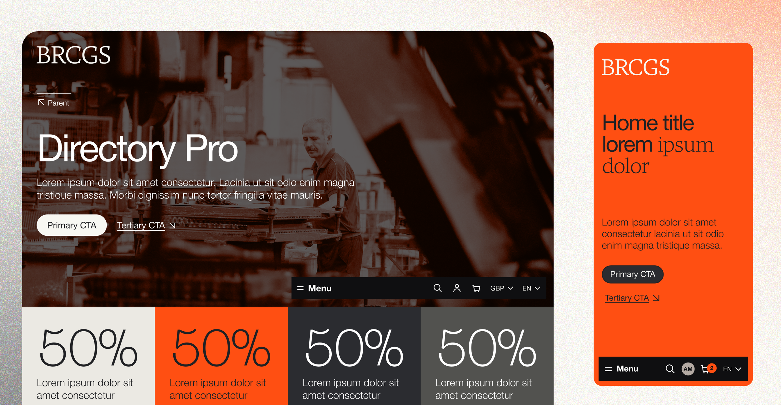
A Swiss-influenced redesign for a global assurance leader, stripping back content and building a distinctive, authoritative presence its sector rarely risks.
Challenge
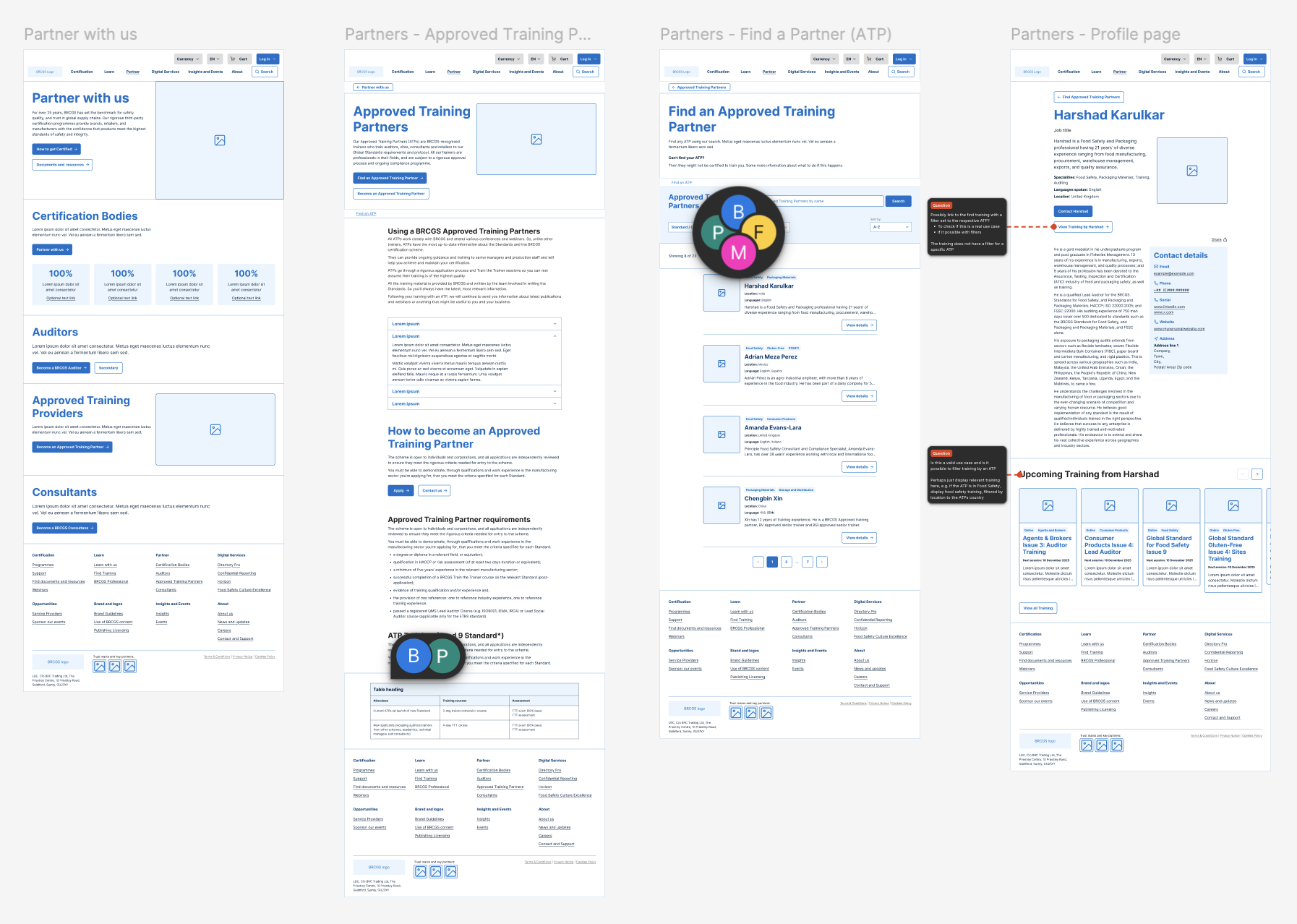
BRCGS is a leading provider of global supply chain assurance programmes, trusted by thousands of organisations worldwide to protect product integrity. Their website needed to match that standing. The existing experience carried too much content, made the breadth of their services and products hard to grasp, and lacked the clear, stewarded journeys that would guide users toward the right actions.
The brief was to rebuild around genuine user needs and insights: to cut and sharpen the content so it landed with impact, to support conversion through clearer journeys, to bring consistency to the branding, and to give the internal team a flexible, easy-to-edit back-end. Underneath it all, the systems and data capture needed to connect seamlessly, so a user could move between platforms without friction.
Solution
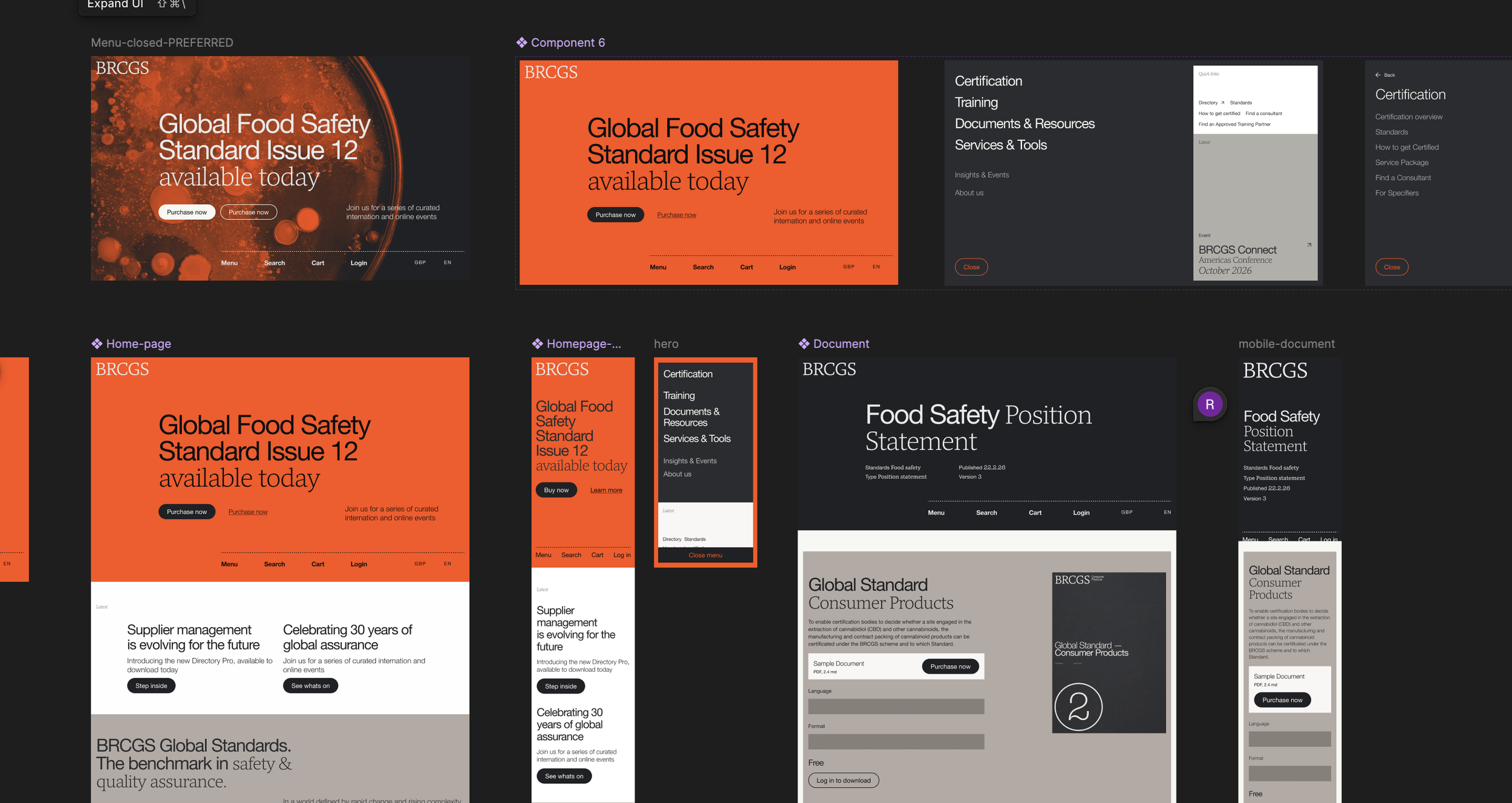
We grounded the work in user needs and insights, then made some brave decisions about content, stripping it back so that what remained was clear and purposeful rather than exhaustive. Every page was built to help users understand the full breadth of what BRCGS offers and to move them toward the right next step.
The design direction was bold: a confident, Swiss-influenced system in the spirit of Dieter Rams, built on strong typography, generous structure, and restraint. It gave BRCGS a distinctive, authoritative presence that few in their sector would risk. The client was brave and trusted the direction, which is what allowed the work to be as strong as it is. Alongside the visual system, we designed stewarded journeys that connected content, systems, and data capture into one coherent experience, and delivered a flexible component-based back-end so the team could curate and edit with confidence.
Pattern Library
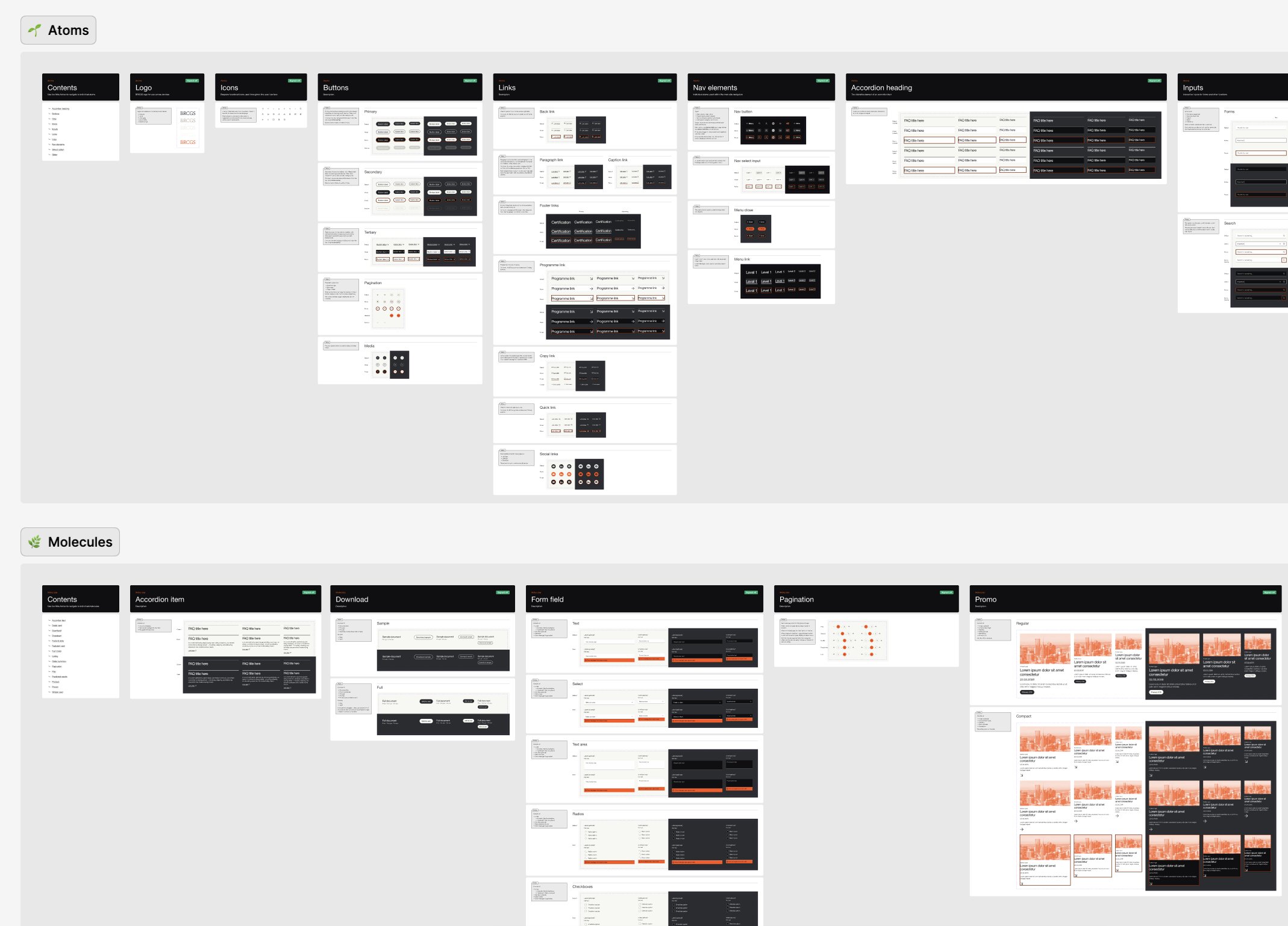
In Figma, we built a set of carefully crafted pattern libraries grounded in atomic design: all component-based, structured through variants and tokens, and built on solid foundations. That structure means we can prototype at speed and hand off cleanly into AI for design and MCP driven build.
Impact
Still in development. This section will be completed once the site is live and performance data is available. Likely measures to capture: conversion rate improvements, reduction in content volume, engagement with key journeys, and accessibility scores.